Britannia, a leading global financial group offering investment banking, securities, brokerage, asset and wealth management, banking, and trust products and services, appointed Nask Studio to conduct a global brand audit and refresh its corporate visual identity. This comprehensive project included a thorough review of all sub-brand architectures, brand strategy, art direction for iconography, graphic and typographic enhancements, as well as web design.
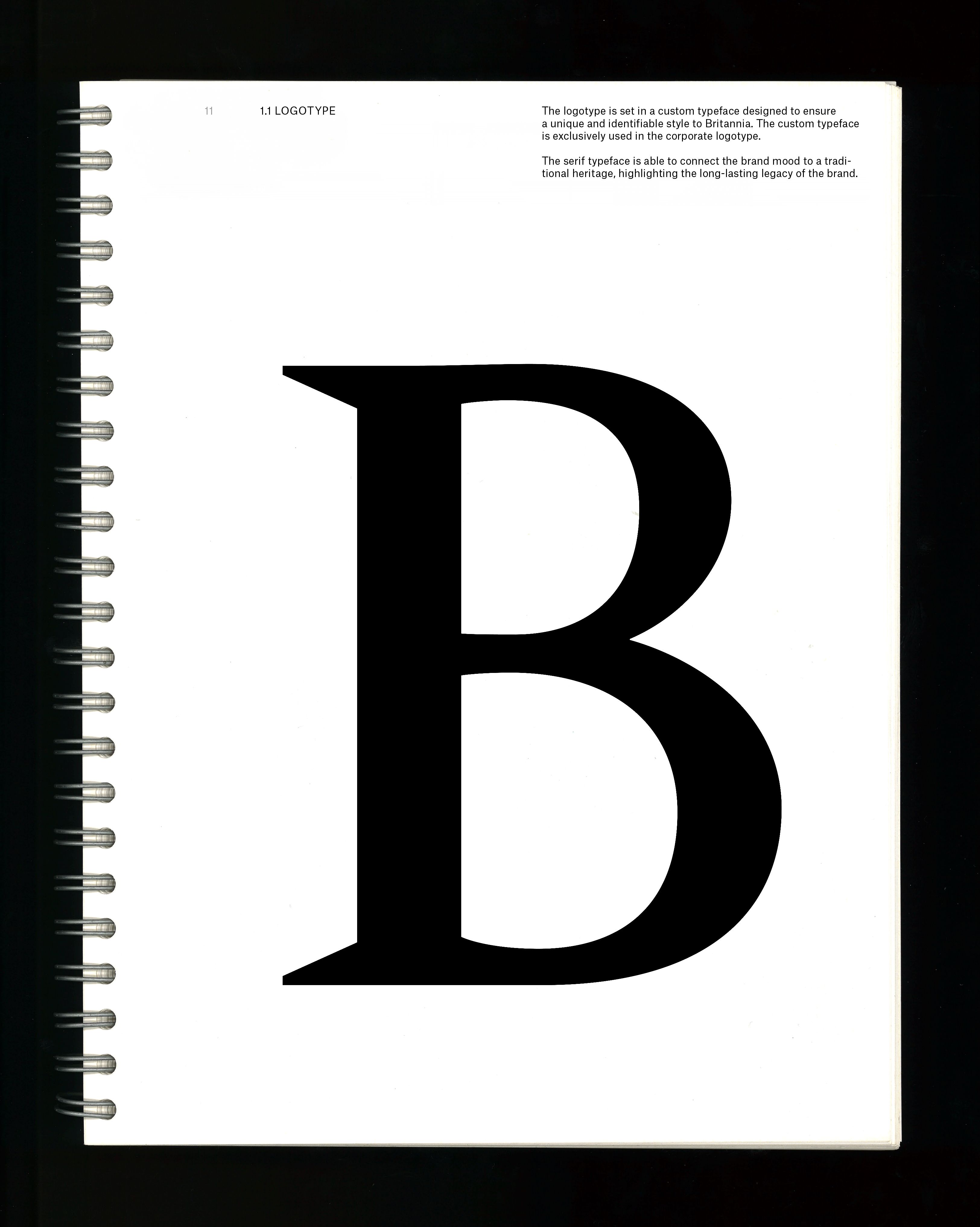
Through our audit, Nask Studio identified Britannia’s hallmark: a symbol that embodies accuracy in services and acts as the brand’s coat of arms, reflecting its deep-rooted legacy. Initially designed using the overused Trajan typeface, the identity required a refined uplift. Nask Studio reworked this typeface, improving and customizing pre-existing elements to elevate the visual identity. By maintaining a serif type, we successfully connected the brand’s mood to its traditional heritage, while enhancing its future-oriented approach with the addition of Atlas Grotesk, a modern sans-serif font from Commercial Type.
Britannia stands for trust, excellence, discretion, customization, and comprehensive service, and we crafted a visual language that reflects these core values. Our iconography and four-level communication strategy ensure an immersive, informative, and comforting user journey. Through this refresh, Nask Studio preserved Britannia’s legacy while modernizing its visual identity for a contemporary, cohesive, and forward-thinking presence.